Our Identity
Water Safety New Zealand's visual identity is built around our nations connection to wai, our belief systems, and our commitment to helping everyone in Aotearoa enjoy the water safely.
The design system takes cues from the power of Tangaroa, his guardianship, and how we as a country enjoy our waterways.
The simplicity of the design system makes space for our messages to do the loud talking. If in any doubt while using this brand, "less is more" should be your guiding principle.
Primary Lockup
We lead with our combined logomark as the hero of our identity. Our eye of Tangaroa represents our culture, and our name gives context to our purpose. We should always lead with this as a primary logomark. For social profiles, tighter spaces, or vertical layouts - we use our eye of Tangaroa icon.


.75’’ or 50px
MINIMUM SIZE
This version is not intended for extremely small sizes. The minimum height is .75” for print applications and 50px for digital applications.
Clear Space
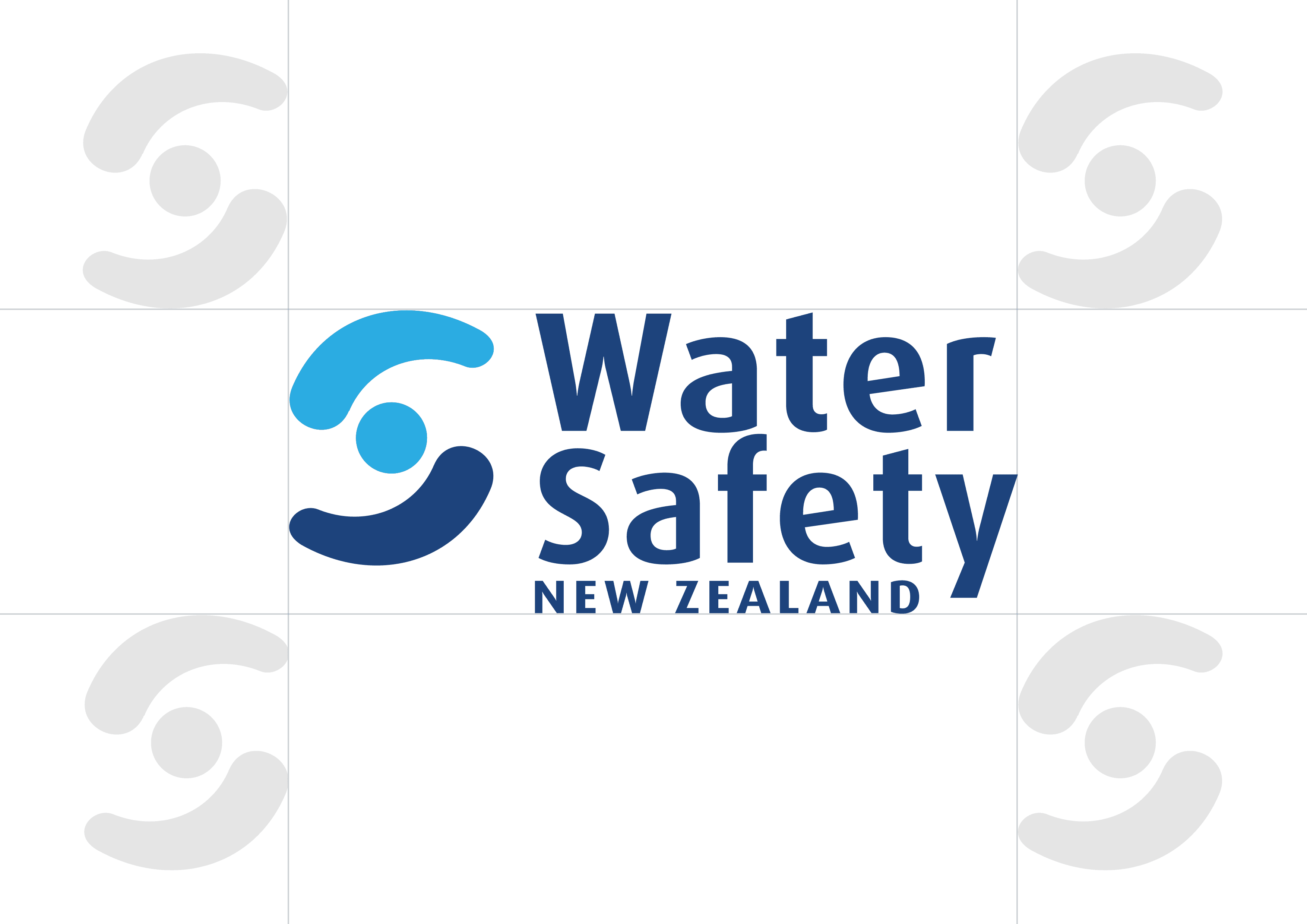
Clear space, or negative space, is the area that surrounds the logo that is completely clear of any other graphical element. Clear space helps the logo stand out from the rest of the elements on the page and ensures legibility, even at small sizes.
As a general rule, the more clear space around the logo, the better. If you need help applying the correct clear space, use this diagram and the relative size of the eye of Tangaroa as a reference guide.
Color Variations
The primary colours of the Water Safety New Zealand identity take cues from our nations waterways. These colours have been chosen to represent the authenticity of our culture and brand.
"Moana" (deep blue) is our primary brand colour, it's dominant, adaptable, and a representation of our connection to the oceans that surround our island nation.
"Waipuna" (light blue) represents the light, clear water from springs. It is particularly suited as an accent colour to darker backgrounds or when used in combination with 'Moana' as seen in our primary logo lockup.
"Tuna" (off-white) is our primary neutral. It reflects the whitewater and currents in our rivers. This is the colour you should use when placing the logo on top of imagery, or when using the logo on dark backgrounds. You can also use this as a background accent colour to draw attention to key information.
"Pango" (black) - Preferably we avoid using our logo in black and find that "Moana" can generally be used as our high contrast option. However, if required by certain applications you can use the logo in black as long as it all single tone.


Icon Only Lockup
The icon-only logo lockup for Water Safety New Zealand is our eye of Tangaroa. It should be useful in situations where the wordmark lockup cannot be scaled appropriately. It can be used alone or in combination with the primary wordmark where space permits.


Logo Misuse
This page illustrates how not to use the Water Safety New Zealand logo. These examples represent some of the most common errors, but do not necessarily constitute an exhaustive list. To maintain consistency of the Water Safety New Zealand logo, follow the guidelines outlined in this document.
Never attempt to alter, redesign, or add to the Water Safety New Zealand logo lockup.
Do not change the logo color outside of the approved palette.
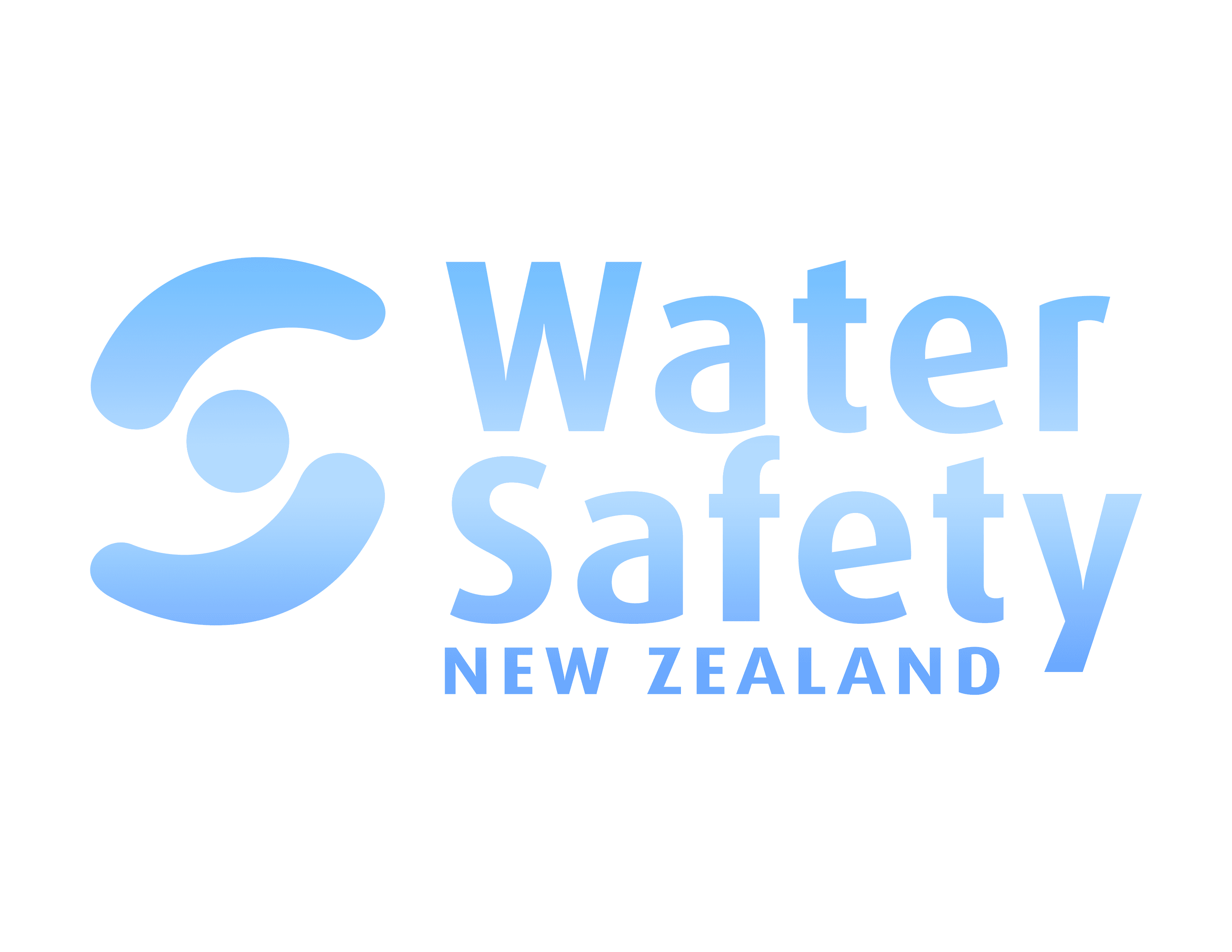
Do not apply a gradient or pattern fill to the logo.
Do not outline the logo.
Do not stretch, distort, or warp the logo in any way.
Do not crop or cut off the logo.
Do not change the typeface or recreate the Word mark.
Do not rotate the primary or icon versions logo.
Do not add a drop shadow or any other effect to the logo.
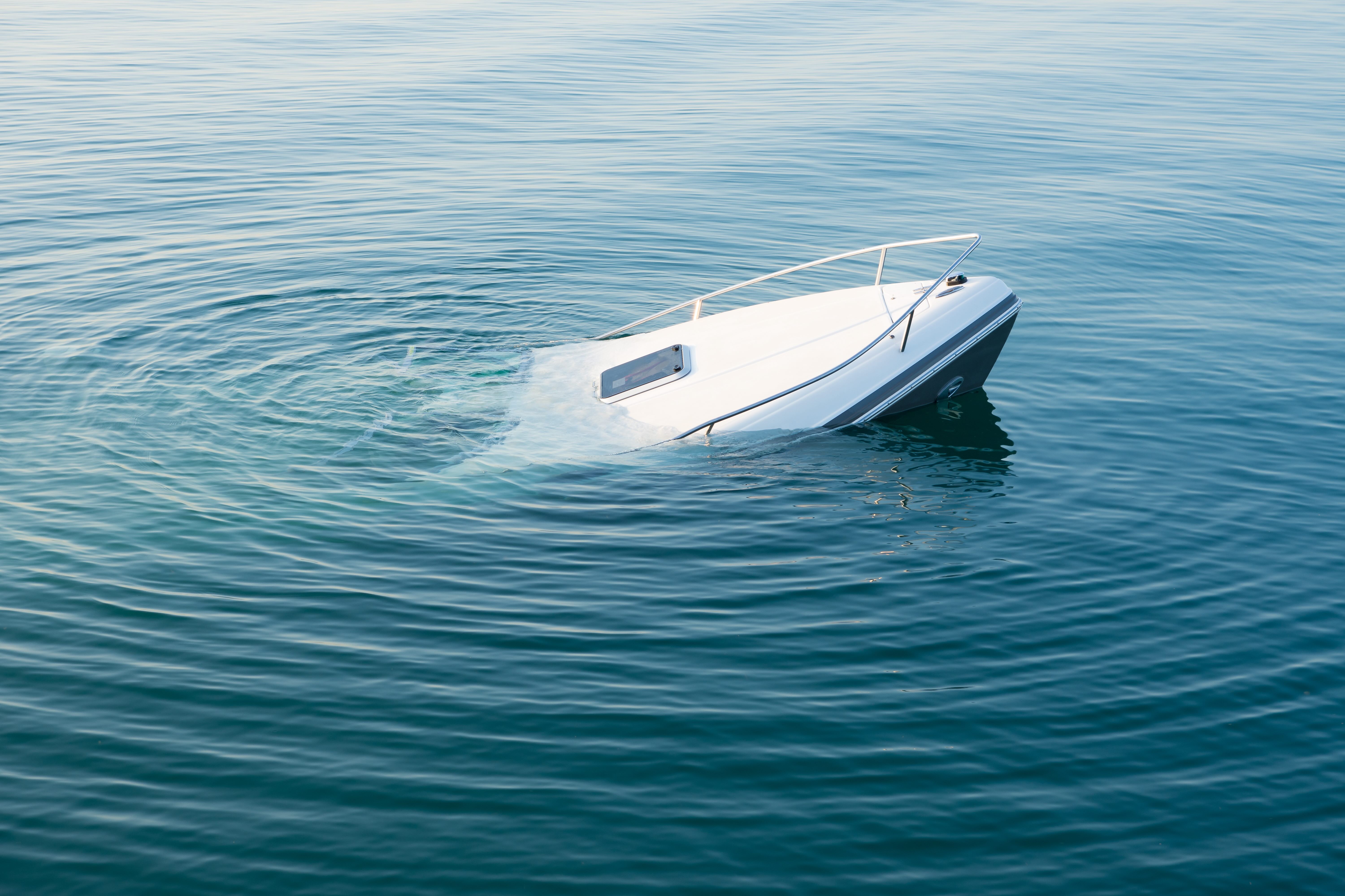
Do not position the logo over off-brand colors, patterns, or busy backgrounds.
